Tilted Card
Interactive card with 3D tilt effect and smooth animations
Configuring your account...
Please wait while we prepare everything for you
Usage
import TiltedCard from './TiltedCard';
<TiltedCard
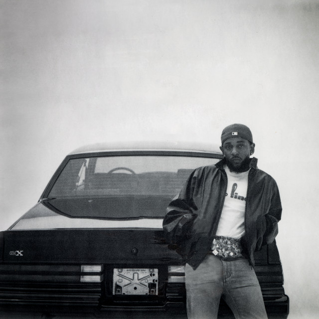
imageSrc="https://i.scdn.co/image/ab67616d0000b273d9985092cd88bffd97653b58"
altText="Kendrick Lamar - GNX Album Cover"
captionText="Kendrick Lamar - GNX"
containerHeight="300px"
containerWidth="300px"
imageHeight="300px"
imageWidth="300px"
rotateAmplitude={12}
scaleOnHover={1.2}
showMobileWarning={false}
showTooltip={true}
displayOverlayContent={true}
overlayContent={
<p className="tilted-card-demo-text">
Kendrick Lamar - GNX
</p>
}
/>Props
| Prop | Type | Default | Description |
|---|---|---|---|
imageSrc | string | - | Source URL of the image |
altText | string | 'Tilted card image' | Alt text for the image |
captionText | string | '' | Text for the tooltip caption |
containerHeight | string | '300px' | Height of the container |
containerWidth | string | '100%' | Width of the container |
imageHeight | string | '300px' | Height of the image |
imageWidth | string | '300px' | Width of the image |
scaleOnHover | number | 1.1 | Scale factor on hover |
rotateAmplitude | number | 14 | Rotation amplitude for tilt effect |
showMobileWarning | boolean | true | Show mobile warning message |
showTooltip | boolean | true | Show tooltip on hover |
overlayContent | React.ReactNode | null | Content to display as overlay |
displayOverlayContent | boolean | false | Whether to show overlay content |